- What? D3 is a javascript library for creating interactive, dynamic data visualizations in the browser.
- How? D3 Uses digital data to drive the formation, control and graphical presentation. D3 stands for Data Driven Document.
- Why? D3 is an open source, an extremely helpful in viewing huge data & data visualization is the best way to understand, represent & analyze.

Let’s create a simple bubble chart with d3.
1. Get the dataset that you like to visualize
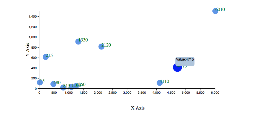
 // dataset
var dataset = [
[15, 120], [480, 90], [1250, 50], [1100, 33], [1330, 915],
[4110, 112], [4715, 414], [215, 617], [815, 21], [2120, 818],
[6010, 1510]
];
2. Define dimensions of the chart ie. heigh, width and padding
//Defining Width, height and padding
var w = 600;
var h = 350;
var padding = 70;
3. Create x-scale
 var xScale = d3.scale.linear()
.domain([0, d3.max(dataset, function (d) { return d[0]; })])
.range([padding, w - padding * 2]);
4. Create y-scale
 var yScale = d3.scale.linear()
.domain([0, d3.max(dataset, function (d) { return d[1]; })])
.range([h - padding, padding]);
d3 provides different scales depending on the type of input data set we choose the appropriate suitable scale, here we are using a linear scale. the domain is the input values and range is nothing but the output element.
5. Define x-axis
 // define xAxis
var xAxis = d3.svg.axis()
.scale(xScale)
.orient('bottom');
6. Define y-axis
 // define yAxis
var yAxis = d3.svg.axis()
.scale(yScale)
.orient("left");
We use d3 axis method to define an axis. To scale the method we need to pass the scales that we created initially. Orient method is to specify the position of the axis.
7. Create SVG
 // create svg
var svg = d3.select("body")
.append("svg")
.attr("width", w)
.attr("height", h);
appending chart to the body tag, you can use a tag of your choice.
8. Create circles/bubbles
 //Create circles
svg.selectAll("circle")
.data(dataset)
.enter()
.append("circle")
.attr("cx", function (d) { return xScale(d[0]) })
.attr("cy", function (d) { return yScale(d[1]) })
.attr("r", 10)
.attr("fill", 'cornflowerblue')
enter method creates the initial data to elements. creating a circle element for each data element in the array. cx, cy and are circles x position, y position, and radius.
9. Create x-axis
//create xAxis
svg.append('g')
.attr("class", "axis")
.attr("transform", "translate(0," + (h - padding) + ")")
.call(xAxis)
10. Create y-axis
 //create yAxis
svg.append("g")
.attr("class", "axis")
.attr("transform", "translate(" + padding + ", 0)")
.call(yAxis);
transform attribute is the and call method to create y-axis.
You can find the above code working demo and some additional charts to learn here https://github.com/vijaygattineni/D3js-project
The main advantage of d3js over other libraries is we have full control over the chart, that helps us in creating custom charts.